Tattoo fonts guide: typewriter, gothic, script and fine line styles
A field guide to the letterforms people choose to carry on their skin.
Tattoos Are a Language
For a long time, tattoos were seen as images: dragons, roses, skulls, sailors’ anchors. Words were secondary—names, dates, fragments of poetry squeezed awkwardly between shoulder blades.
But something shifted over the last fifteen years.
Typography—actual letterform culture—entered tattooing.
Now people think about kerning, serif weight, stroke tension, and the emotional tone of a typeface. Fonts aren’t just decoration anymore; they shape the meaning of the words themselves. A phrase tattooed in gothic blackletter says something completely different than the same phrase in a delicate fine line script.
Your tattoo doesn’t just say something. It speaks in a voice.
And if you’re going to put language permanently on your body, it helps to understand the dialects.
Here’s a practical guide to four of the most requested tattoo font families today: typewriter, gothic, script, and fine line—where they come from, why people choose them, and what actually works on skin long-term.
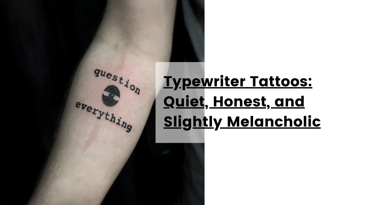
Typewriter Tattoos: Quiet, Honest, and Slightly Melancholic
Typewriter tattoos have a particular emotional tone. They feel like something found in a letter you weren’t supposed to read. A confession typed late at night. A line from a notebook.
The appeal comes from the mechanical imperfections of old typewriters. Slightly uneven letters, inconsistent ink density, and tiny misalignments give the text a human vulnerability. Even though the machine produced it, it feels intimate.
Where the style comes from
Typewriter fonts imitate mechanical typefaces from early 20th-century writing machines like:
-
Courier
-
American Typewriter
-
Olympia and Remington letterforms
In tattoo culture, the style became popular in the late 2000s when minimalist tattoos began replacing heavy traditional flash among younger clients.
People started tattooing:
-
poetry lines
-
song lyrics
-
personal mantras
-
fragments of literature
The tone was different from classic lettering tattoos. Less aggressive. Less performative.
More introspective.
Why people choose it
Typewriter tattoos signal a certain emotional register:
-
sincerity
-
nostalgia
-
quiet introspection
-
literary sensibility
They feel personal rather than ornamental.
You often see them in placements where the wearer can read them themselves:
-
inner forearm
-
ribs
-
collarbone
-
upper thigh
These placements turn the tattoo into something like a private note.
What artists consider technically
Typewriter fonts work well because they sit in a medium-weight structure. The strokes are neither too thin nor too heavy, which means the tattoo ages relatively well.
Still, spacing is critical.
The biggest mistakes artists see with typewriter tattoos are:
-
letters placed too tightly
-
overly small font sizes
-
low contrast between strokes
If the letters are too small, they will blur over time as the ink spreads slightly under the skin.
A good rule in professional studios is simple: Readable at arm’s length on day one = readable in ten years.
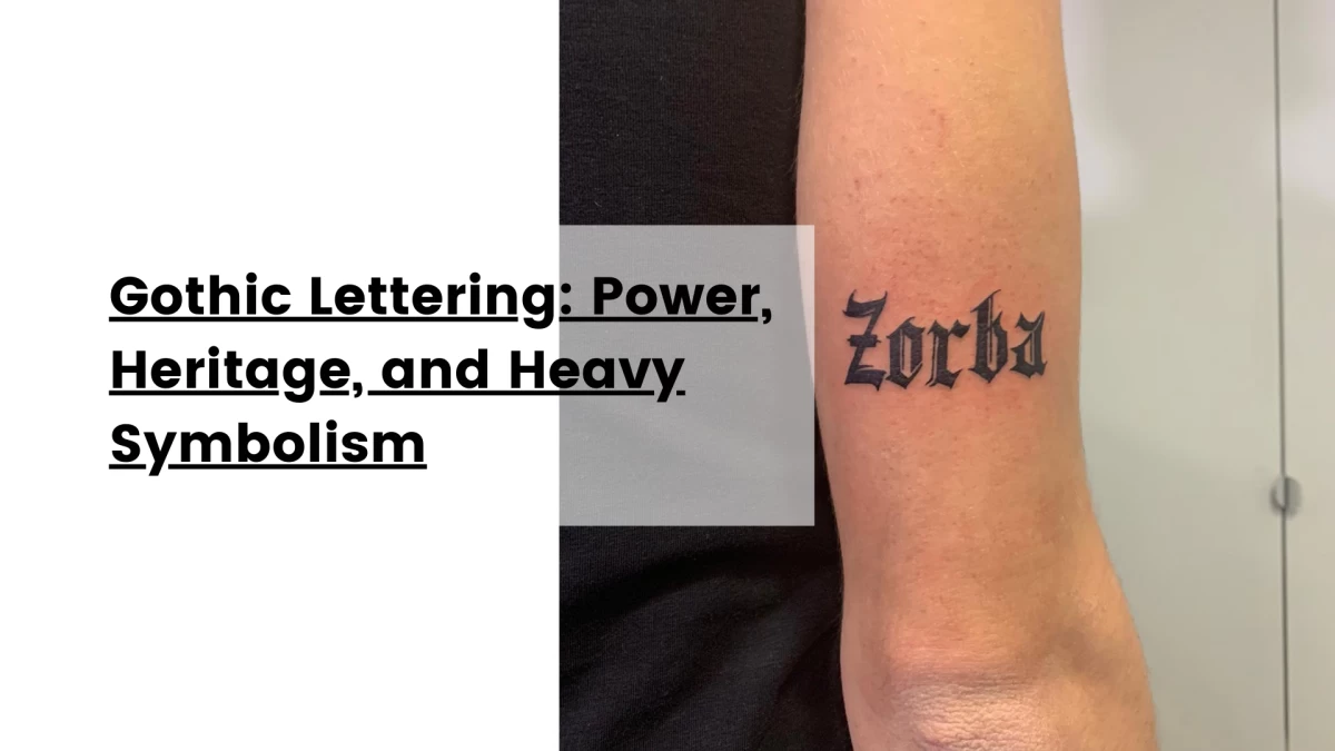
Gothic Lettering: Power, Heritage, and Heavy Symbolism
If typewriter tattoos whisper, gothic tattoos speak loudly.
Gothic lettering—often called blackletter—is one of the oldest typographic traditions still alive in tattooing.
You’ve seen it everywhere:
-
Old English lettering across knuckles
-
Large chest pieces spelling family names
-
Gothic script across backs or stomachs
It carries centuries of visual history.
Where gothic lettering comes from
Blackletter typefaces originated in medieval Europe around the 12th century. Monks copied religious texts using dense angular calligraphy designed to maximize writing speed on parchment.
Later it became associated with:
-
early European printing
-
Germanic typography
-
heraldic lettering
-
newspaper mastheads
Tattoo culture adopted it heavily through:
-
prison tattooing
-
Chicano lettering traditions
-
biker and street culture
By the 1990s and 2000s, gothic lettering had become one of the most recognizable tattoo styles globally.
Why people choose it
Gothic tattoos project a specific type of visual authority.
They feel:
-
permanent
-
declarative
-
historic
-
serious
People often use them for words that carry identity weight:
-
family names
-
hometowns
-
mottos
-
religious phrases
Because the lettering is bold and structured, gothic tattoos hold space on the body differently from other fonts. They often become the central element of a piece.
The craft behind gothic tattoos
Despite looking heavy and bold, gothic lettering is technically demanding.
Each letter has:
-
sharp angles
-
thick vertical strokes
-
precise negative spaces
Small errors in proportion become obvious quickly.
Good gothic tattoos require strong understanding of:
-
calligraphy structure
-
letter rhythm
-
spacing between characters
Experienced tattoo artists often redraw every word manually rather than using a digital font directly.
Why?
Because skin isn’t paper. Letters must be adapted to the body’s movement and curvature.
A chest piece, for example, needs different spacing than a forearm tattoo.
When done well, gothic lettering ages extremely well thanks to its bold lines and strong contrast.
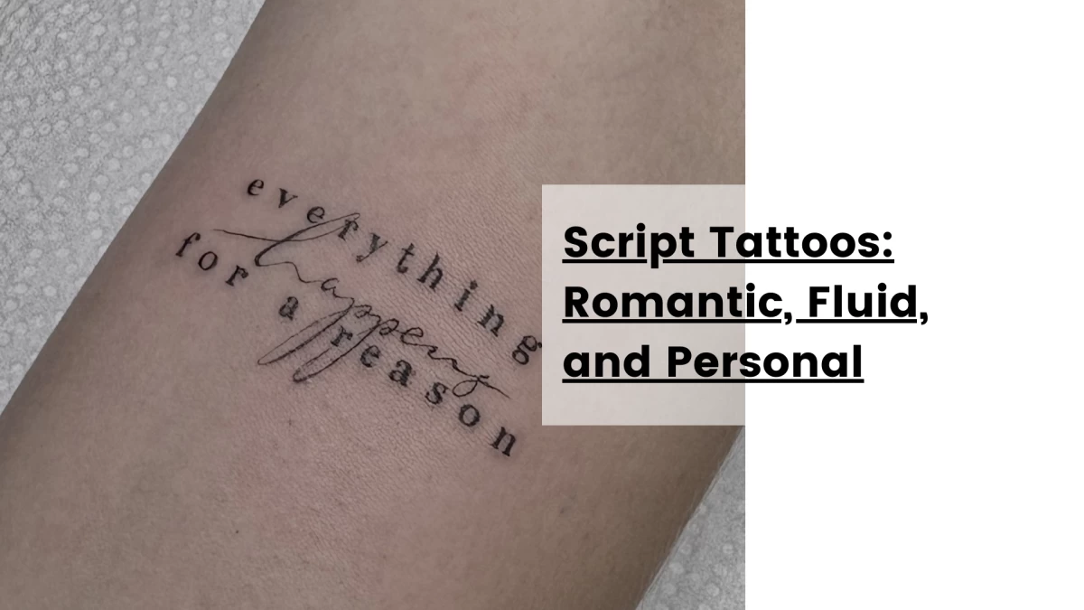
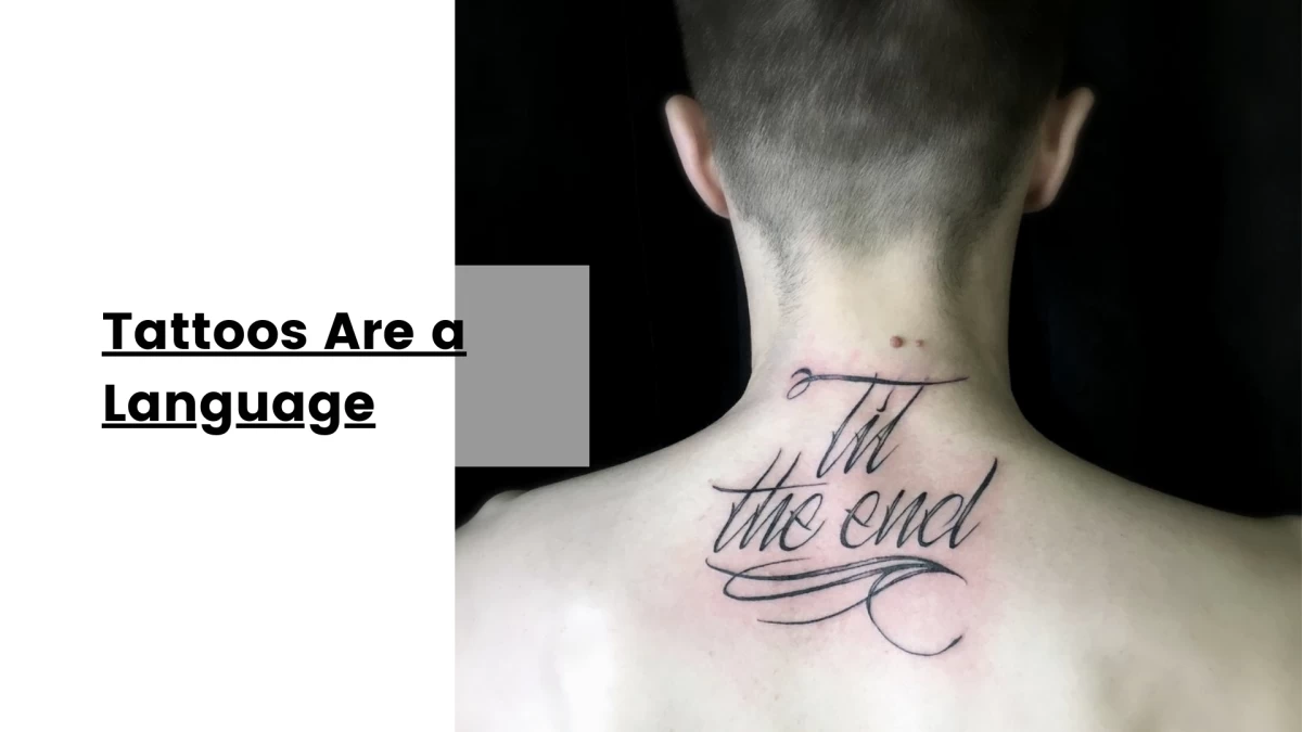
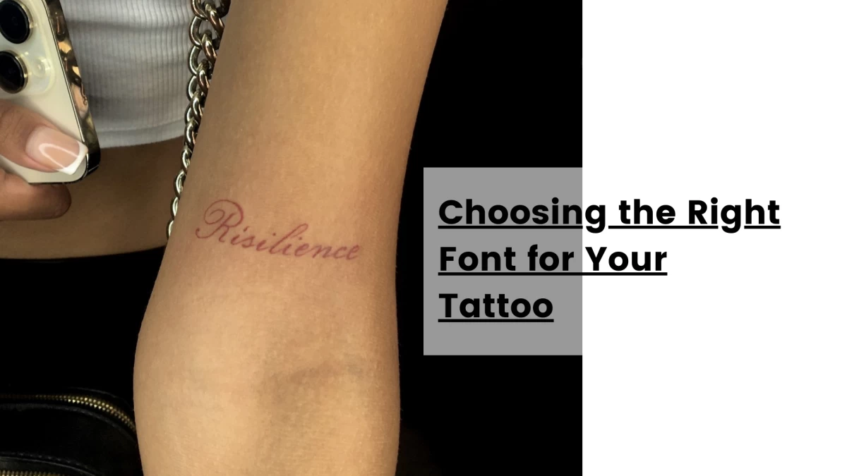
Script Tattoos: Romantic, Fluid, and Personal
Script tattoos are probably the most emotionally expressive of the lettering styles.
They imitate handwriting. Not just any handwriting—but the kind that looks like it came from a fountain pen, a love letter, or a carefully written signature. Script tattoos feel intimate. They feel like they belong to someone.
Where the style comes from
Script lettering in tattooing is heavily influenced by:
-
calligraphy traditions
-
Spencerian script
-
copperplate lettering
-
modern brush lettering
In the tattoo world, script gained enormous popularity through Chicano tattoo culture, where flowing cursive lettering became a defining visual language.
Over time, script evolved into many variations:
-
elegant cursive
-
brush-style lettering
-
handwritten notes
-
signature-style tattoos
Today script tattoos appear everywhere—from delicate wrist tattoos to large flowing back pieces.
Why people choose script
Script tattoos emphasize emotion and individuality.
They’re commonly used for:
-
names
-
quotes
-
dedications
-
memorials
Because script resembles handwriting, it feels personal in a way that printed fonts rarely do. Some people even tattoo actual handwriting from loved ones, which can be incredibly meaningful.
What makes script tattoos difficult
Script tattoos look effortless, but they’re deceptively complex.
Artists must control:
-
stroke thickness variation
-
smooth line flow
-
consistent spacing
-
elegant curves
A single shaky line can break the illusion of fluid handwriting. Another challenge is legibility over time. If the loops and flourishes are too tight, the tattoo can blur as the skin ages. Good script tattoos balance beauty with breathing space. The best script tattoos look like they were written in a single confident motion
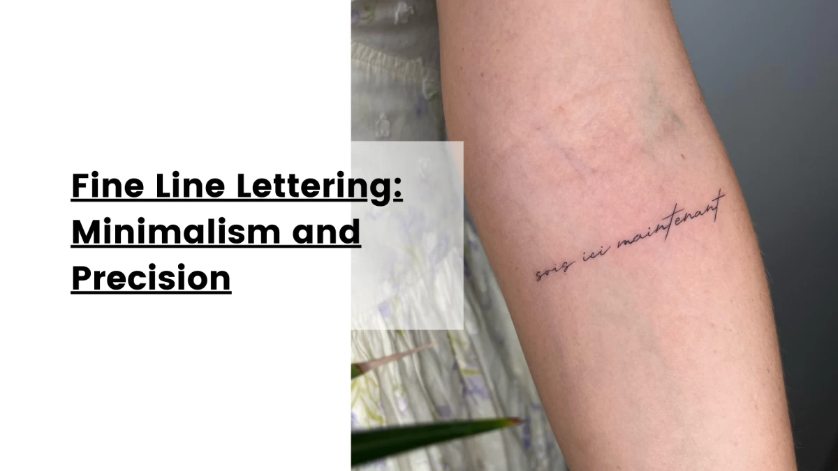
Fine Line Lettering: Minimalism and Precision
Fine line lettering is the quiet minimalist cousin of the tattoo world.
Where gothic lettering is loud and bold, fine line tattoos almost disappear into the skin.
The aesthetic is delicate, precise, and contemporary.
Where fine line comes from
Fine line tattooing emerged from a combination of influences:
-
minimalist design culture
-
single-needle tattoo techniques
-
modern micro tattoo trends
It became widely popular in the 2010s as tattoo culture expanded beyond traditional heavy styles. Social media accelerated the trend, especially through small tattoos that photographed beautifully. Tiny words. Minimal phrases. Almost invisible lines.
Why people love it
Fine line tattoos feel subtle and modern.
They’re popular with people who want tattoos that are:
-
discreet
-
elegant
-
lightweight visually
Common placements include:
-
wrists
-
inner arms
-
ankles
-
behind the ear
-
ribs
Because the tattoos are small, they often function like personal reminders rather than public statements.
The reality of fine line tattoos
Fine line lettering requires extreme precision. But it also raises an important technical issue: aging. Very thin lines can fade faster than bold tattoos. Over time, skin regeneration and natural ink spread can soften the letters. That doesn’t mean fine line tattoos are bad—it just means they need thoughtful design.
Professional artists usually adjust:
-
line thickness
-
spacing
-
size
to ensure the tattoo remains readable years later. Minimalism still needs structure.
Choosing the Right Font for Your Tattoo
People often arrive at studios with a phrase and a font downloaded from the internet.
But tattoo lettering isn’t the same as graphic design. Several factors matter when choosing the right style:
1. Placement on the body
Different body areas distort letters differently.
Flat areas work best for text:
-
forearms
-
upper back
-
ribs
-
chest
Curved surfaces require more adaptation.
2. Size
Small lettering can look elegant, but going too small risks illegibility over time.
Most professional artists recommend at least 1–1.5 cm letter height for long-term readability.
3. Meaning and tone
Fonts carry emotional context.
A gothic font changes the tone of a sentence compared with a soft script.
The visual voice should match the message.
4. Longevity
Bold styles age better than extremely thin ones.
Spacing and structure are key to keeping the tattoo readable in ten or twenty years.
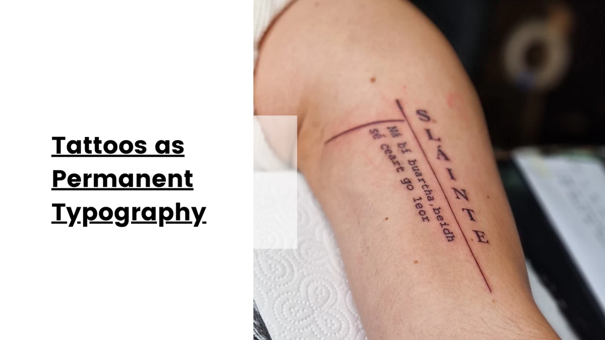
Tattoos as Permanent Typography
At its core, lettering tattoos are a fascinating collision between language and body.
Typography usually lives on screens and paper—temporary surfaces.
Tattooing takes those letterforms and places them somewhere far more permanent.
On skin, fonts stop being abstract design choices.
They become part of identity.
A typewriter phrase becomes a quiet confession someone carries for life. A gothic word becomes armor. A flowing script becomes a memory of someone loved.
And a fine line sentence becomes a whisper that only the wearer fully understands. Fonts matter because voices matter. And when words become tattoos, the voice you choose stays with you forever.
Hélène
This might interest you
Here’s a selection of related posts