Single word tattoos: powerful minimalism and placement ideas


When one word is enough
Minimalist tattoos have evolved far beyond trend status. What once felt like an aesthetic preference now operates as a distinct visual philosophy. Among the purest expressions of this shift sits the single word tattoo — arguably one of the most deceptively simple yet conceptually charged choices a person can make.
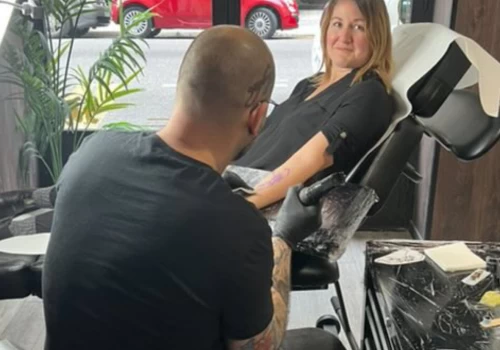
At Black Hat Tattoo Studio Dublin, single word tattoos are requested with striking frequency. Not because they are “small tattoos” or “quick pieces,” but because they achieve something unusually precise: emotional density with minimal visual footprint.
A single word, when selected carefully, can function as identity, reminder, memory, philosophy, defiance, grounding, or quiet affirmation.
Few tattoo formats deliver that level of compression.

Why Single Word Tattoos Feel So Powerful
Words behave differently from images.
Illustrative tattoos invite interpretation. They communicate through symbolism, composition, mood, and visual storytelling. A word bypasses that process entirely. Its meaning is direct, cognitive, immediate.
There is no translation layer.
Yet paradoxically, words often feel more personal than imagery precisely because of this clarity. A single term can encapsulate complex emotional landscapes without visual elaboration.
Consider the difference.
An elaborate design representing resilience. Versus a single word: Resilient.
One suggests. The other states.
That distinction alters psychological impact.
Single word tattoos often feel decisive. They carry a certain conceptual authority. They read less like decoration, more like internal language externalised.
Minimal, but rarely neutral.

Minimalism Without Weakness
Minimalist tattoos are sometimes misunderstood as cautious choices. In reality, reduction amplifies meaning.
The fewer the elements, the greater the exposure of intention.
A large composition distributes attention across multiple visual components. A single word concentrates everything — typography, placement, line quality, spacing, balance, semantic weight — into one focal point.
There is no visual noise.
Which is precisely why single word tattoos often feel stronger, not softer.
They operate with precision rather than spectacle.
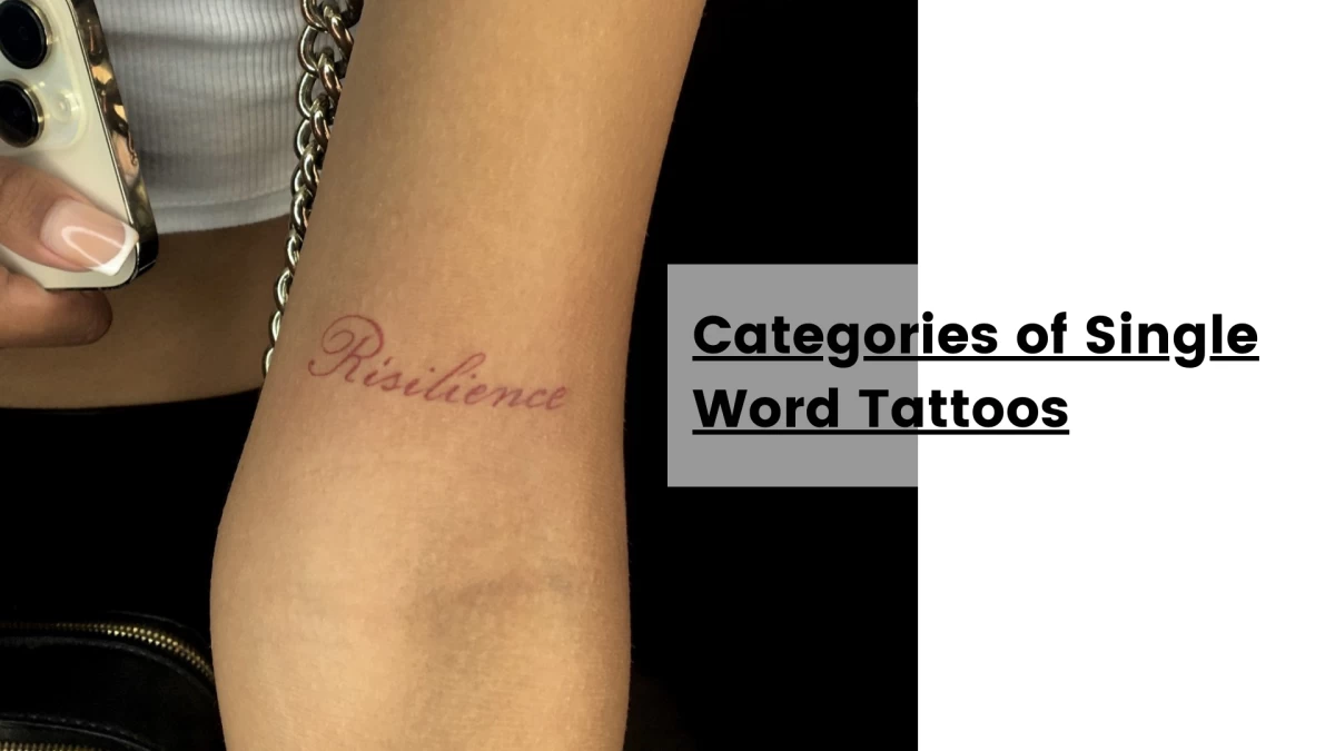
Categories of Single Word Tattoos
While motivations vary widely, certain conceptual themes recur consistently in studio practice.
Identity markers such as Enough, Becoming, Still, or Evolving tend to function as narrative anchors rather than static labels. They acknowledge movement rather than fixed states.
Mindset-oriented words like Breathe, Patience, Focus, or Forward frequently operate as behavioural reminders. They are less descriptive, more regulatory.
Emotionally charged selections — Hope, Chaos, Calm, Wild, Soft — often reflect internal tensions or desired orientations rather than literal self-descriptions.
Then there are words chosen for their ambiguity. Terms that resist rigid interpretation tend to age psychologically well. Openness permits reinterpretation as life contexts shift.
A good word tattoo does not trap identity.
It accommodates evolution.
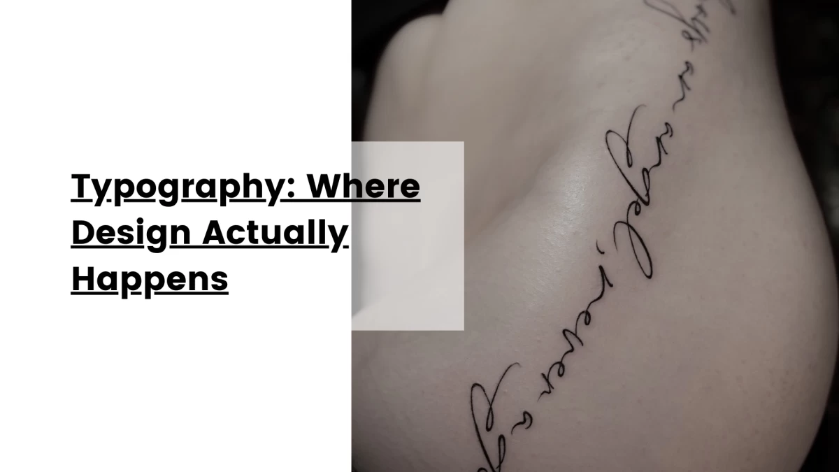
Typography: Where Design Actually Happens
In a single word tattoo, typography is not decoration.
It is the tattoo.
Every nuance matters.
Stroke weight influences perceived strength. Letter spacing governs rhythm. Contrast shapes elegance. Curvature affects flow. Serif vs sans serif alters tone. Script introduces softness or intimacy. Minimalist geometric lettering communicates restraint or modernity.
The word remains constant.
The typography defines perception.
A word rendered in delicate fine line script communicates differently than the same word executed in bold minimalist sans serif.
Neither is inherently correct.
Typography must align with both the semantic energy of the word and the anatomical context of placement.
This is where many minimalist tattoos succeed or fail.
Not conceptually, but structurally.
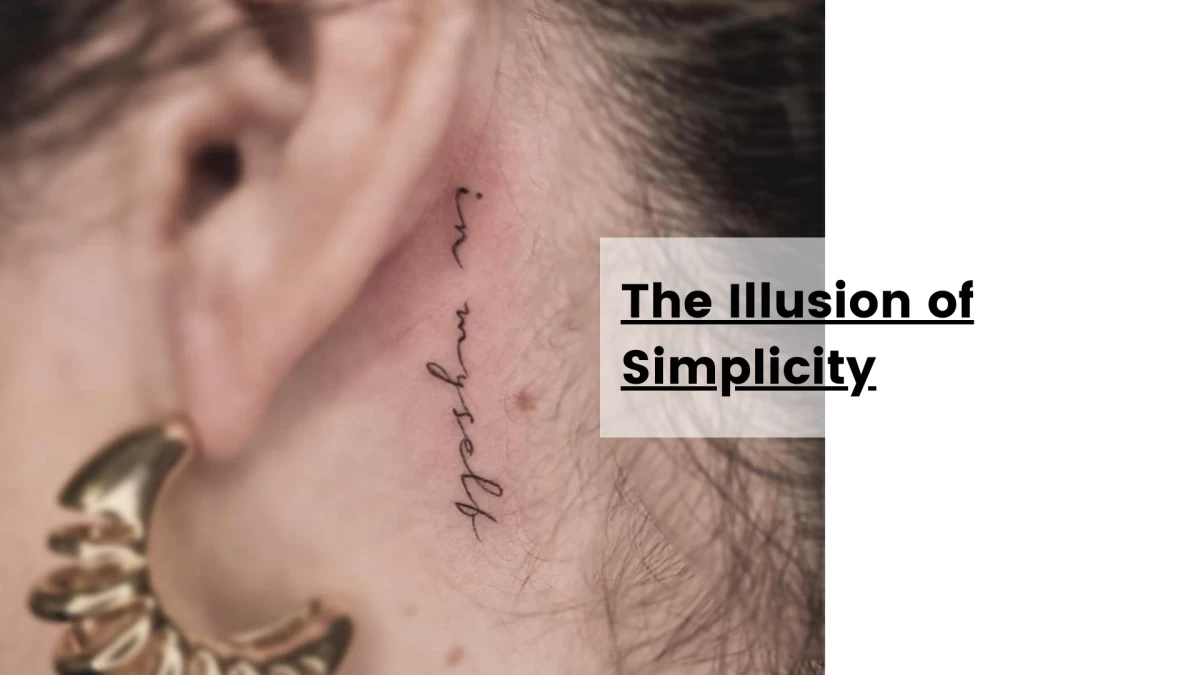
The Illusion of Simplicity
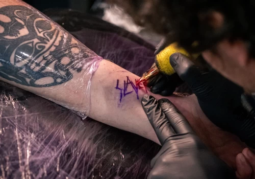
Single word tattoos appear minimal. Their technical demands are anything but.
Lettering is unforgiving by nature. Human perception is acutely sensitive to irregularities in text. Slight line inconsistencies, uneven spacing, depth variations, micro tremors — imperfections become immediately visible.
Unlike illustrative work, lettering provides no camouflage.
Minimalism exposes execution quality with brutal honesty.
This is why at Black Hat Tattoo Studio Dublin, single word tattoos are approached with the same precision considerations as complex compositions. Structural balance, line discipline, spacing accuracy, anatomical flow — these variables determine whether a tattoo feels refined or unstable.
Because minimalist tattoos do not forgive approximation.

Placement: Where Meaning Meets Anatomy
Placement profoundly shapes how a single word tattoo is experienced.
Not merely seen.
Experienced.
A word on the wrist becomes part of constant visual dialogue. It operates as a persistent cognitive presence. This placement often suits regulatory or grounding words — terms functioning as reminders or stabilisers.
The forearm introduces visibility without intimacy overload. It balances readability and discretion. Anatomical linearity supports typographic clarity exceptionally well.
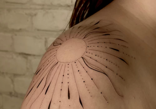
Collarbone placements produce a different effect. Words following bone contours often feel soft, integrated, almost whispered rather than declared. Typography interacts with anatomy, creating fluid visual movement.
Ribcage placements introduce privacy. Words placed here tend to function as internal references rather than outward signals. Visibility becomes selective. Emotional tone shifts accordingly.
Vertical placements along the spine transform words into structural elements. The body becomes compositional axis. The effect can feel architectural, refined, deliberate.
There is no universally superior placement.
There is only perceptual logic.

Scale and Visual Breathing Space
Single word tattoos demand careful scale calibration.
Too small, and legibility degrades. Too large, and minimalism collapses.
Equally critical is spacing. Typography requires breathing space. Compression introduces visual tension and aging risk. Minimalist elegance emerges from proportion, not reduction alone.
A word must occupy space comfortably.
Minimalism is not achieved by shrinking.
It is achieved by balancing.
Aging Behaviour: The Long-Term Perspective
Well-executed lettering tattoos age predictably. Poorly structured ones degrade visibly.
Line weight must remain sufficient to resist visual softening. Spacing must accommodate natural skin evolution. Placement must minimise distortion from movement and anatomical tension.
Blur risk increases when lines are excessively thin or letters overcrowded.
Clean now is easy.
Clean over time is design discipline.
This is why consultations around single word tattoos often involve adjustments invisible to the untrained eye. Minor spacing refinements, stroke calibrations, proportional corrections — small structural decisions that determine long-term clarity.
Minimalist tattoos are governed by microscopic variables.
The Psychological Layer of Word Tattoos
Single word tattoos often function as cognitive anchors.
They are read repeatedly, sometimes unconsciously. They become fragments of internal dialogue. A well-chosen word aligns with self-perception and behavioural orientation. A poorly chosen one introduces subtle friction.
Words on skin are not passive visuals.
They are active language.
This explains why many clients describe their word tattoos as stabilising, grounding, or quietly empowering.
Not because the tattoo changes reality.
But because it reorganises attention.
Why One Word Often Works Better Than Many
There is a structural elegance in reduction.
A single word resists visual clutter. It preserves legibility. It integrates seamlessly with anatomy. It retains conceptual clarity. It ages aesthetically with remarkable stability when designed correctly.
More words introduce complexity.
Complexity introduces risk.
Minimalist tattoos often succeed through restraint rather than elaboration.
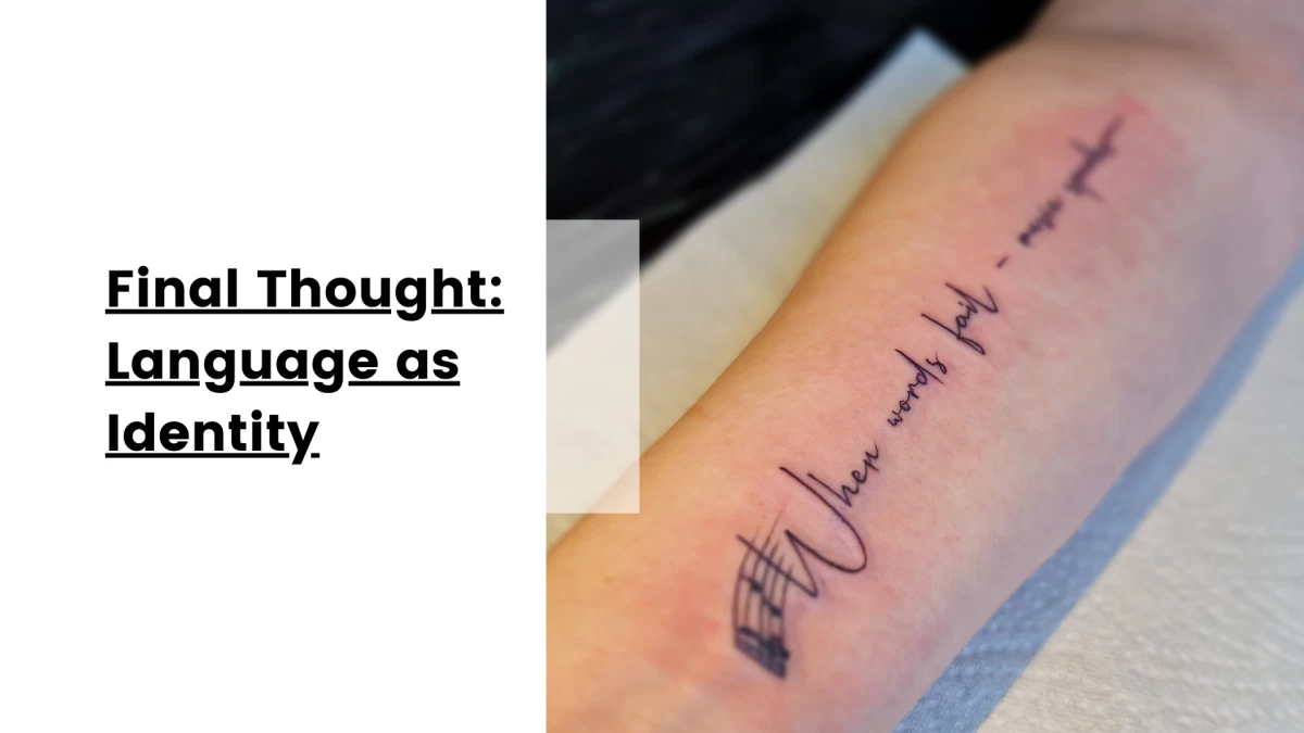
Final Thought: Language as Identity
Single word tattoos sit at a fascinating intersection of design, psychology, and personal narrative. They transform language into visual identity — precise, minimal, enduring.
Quiet, but rarely insignificant. Because sometimes one word is not a reduction.
Hélène
This might interest you
Here’s a selection of related posts