Name and initial tattoos elegant ways to honor your loved ones in Dublin
Because subtle tattoos often carry the strongest stories.
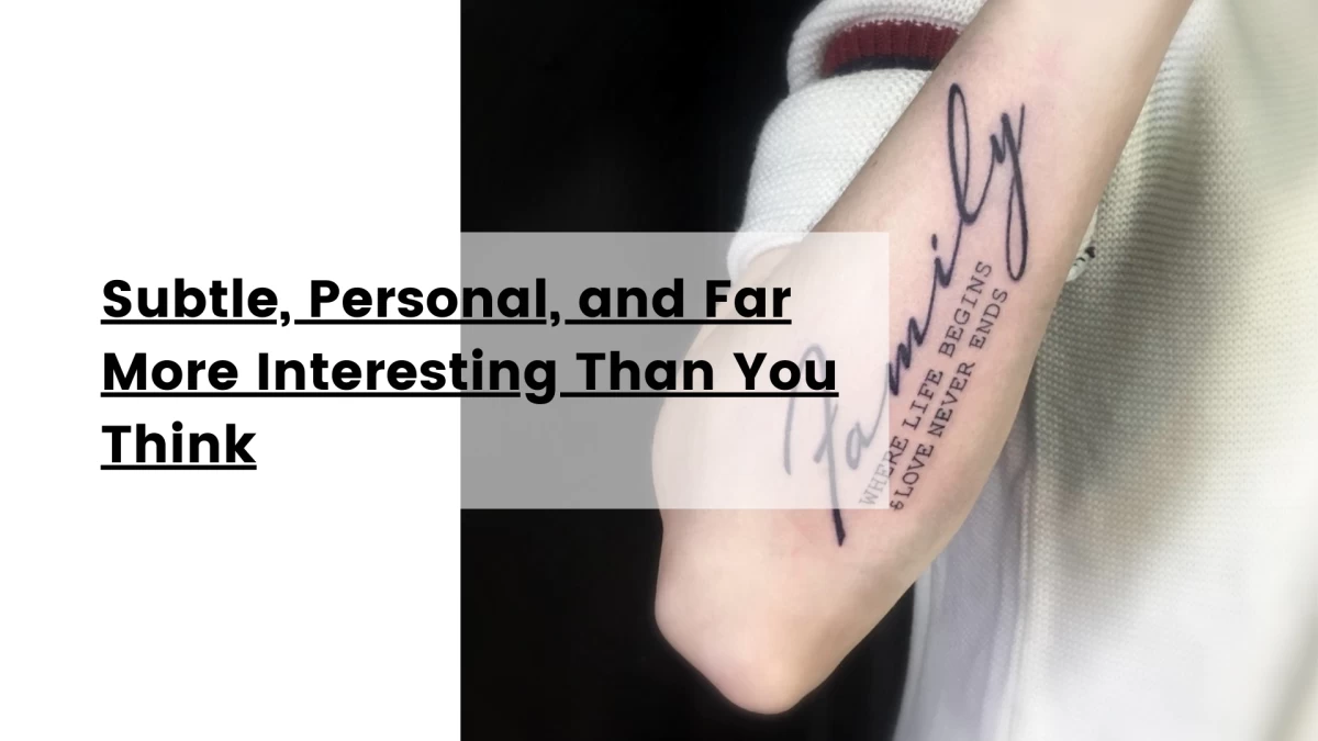
Subtle, Personal, and Far More Interesting Than You Think
Let’s be honest.
Name tattoos don’t always have the best reputation.
Some people hear “name tattoo” and immediately picture dramatic breakups, regrettable teenage decisions, or bold declarations inked in oversized cursive across someone’s neck in 2009.
But here’s the thing.
Like most clichés in tattoo culture, that narrative is outdated.
Because when approached with intention, restraint, and actual design thinking, name and initial tattoos can be some of the most elegant, emotionally intelligent, and visually refined tattoos you can get.
And at Black Hat Tattoo Studio Dublin, this is something we see every single week.
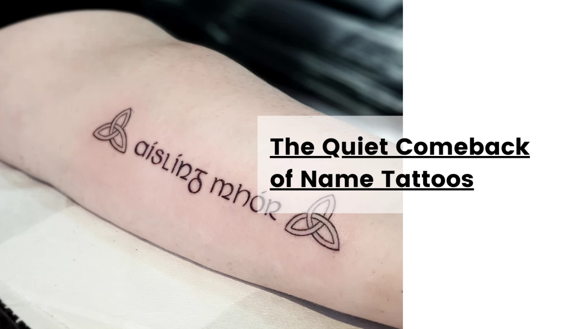
The Quiet Comeback of Name Tattoos
Tattoo trends are cyclical, but they rarely come back in the same form.
What used to be loud becomes subtle. What used to be decorative becomes conceptual. What used to be obvious becomes deeply personal.
Name tattoos are no exception.
Today’s lettering tattoos are:
-
Smaller
-
Cleaner
-
More typographically considered
-
Less about spectacle, more about meaning
In other words, they’ve grown up.
Why People Get Name & Initial Tattoos (And Why It’s Rarely Impulsive)
Contrary to popular belief, most name tattoos today are not reckless decisions made at 2 AM. They’re slow-burn ideas.
They’re tattoos people think about for months — sometimes years.
At our Dublin studio, the motivations tend to fall into a few recurring categories.
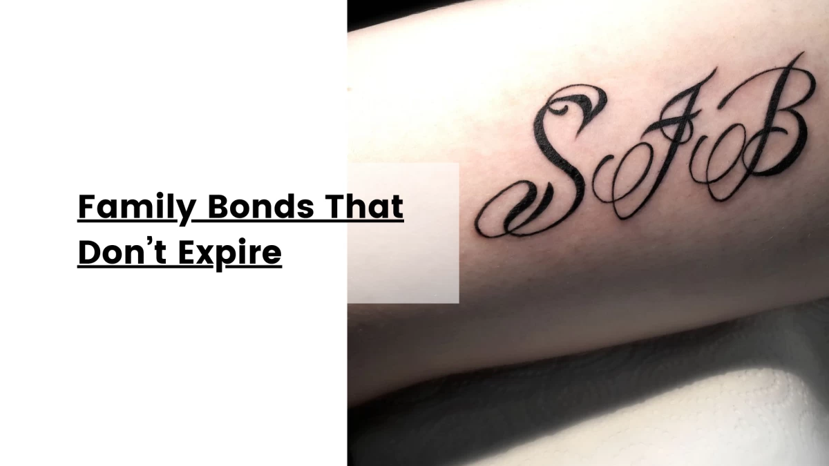
Family Bonds That Don’t Expire
Parents. Children. Siblings. Grandparents.
These tattoos are rarely about drama. They’re about permanence.
A child’s name. A parent’s initials. A subtle tribute to someone who shaped your life.
Unlike romantic relationships, family ties are generally perceived as stable emotional anchors — which is why these tattoos often feel psychologically “safe”.
But safe doesn’t mean boring.
With the right typography and placement, these pieces become quietly powerful.
Memorial Tattoos Without Visual Overload
Not everyone wants portraits, angels, or elaborate symbolism.
Many clients prefer something more discreet.
A name. A date. An initial.
Minimalist memorial tattoos carry a different emotional weight. They don’t shout grief — they integrate memory into everyday life.
These designs often sit on:
-
The wrist
-
The forearm
-
The ribcage
-
Behind the arm
They feel intimate rather than performative.
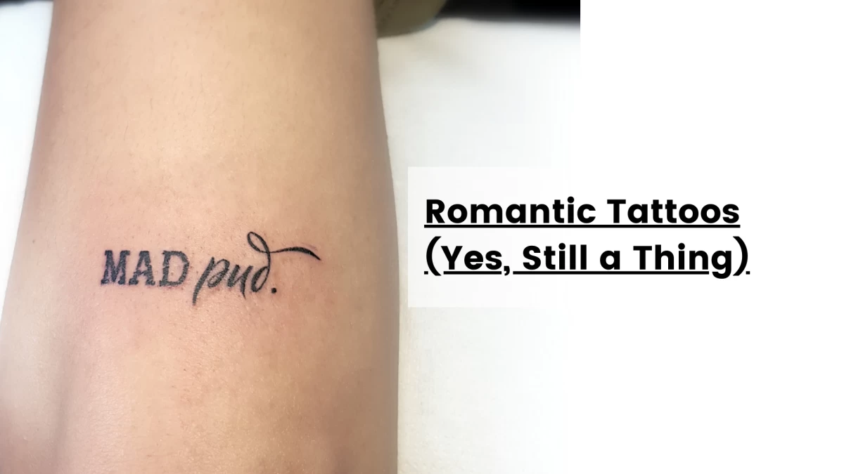
Romantic Tattoos (Yes, Still a Thing)
Despite the warnings, despite the memes, despite your overly cautious friend saying “but what if you break up???”
People still get partner name tattoos. And interestingly, many of them don’t regret it.
Why?
Because tattoos are not contracts. They’re timestamps. They reflect who you were, what you felt, what mattered at a specific moment in your life.
Not every tattoo needs to survive hypothetical future scenarios.
That said — design strategy matters.
The Difference Between a Good Name Tattoo and a Bad One
This is where things get real.
Because lettering tattoos are brutally unforgiving.
There’s no shading to hide mistakes. No heavy composition to distract the eye. No visual noise to camouflage imbalance.
Typography is the tattoo.
Which means small design decisions become critical.
Line Weight: The Invisible Dealbreaker
Too thin → fades visually Too thick → loses elegance Too inconsistent → looks amateur
Fine line lettering, when done correctly, ages beautifully. But “fine line” does not mean “fragile line”.
Precision is everything.
At Black Hat Tattoo Studio Dublin, lettering work is approached like graphic design on skin — not just writing with a needle.
Spacing & Flow: Why Your Tattoo Can Feel “Off”
Ever seen a tattoo that looked technically clean but somehow… wrong?
That’s often spacing.
Kerning, letter rhythm, visual balance — these concepts aren’t just for designers. They directly impact tattoo aesthetics.
Good lettering feels effortless.
Bad lettering feels awkward, even if you can’t articulate why.
Font Choice: Please, Let’s Talk About This
Not all scripts are created equal.
Some fonts:
-
Age poorly
-
Lose legibility
-
Feel trend-specific
-
Carry unintended stylistic baggage
The goal isn’t just to pick something “pretty”.
It’s to select a typography style that matches:
-
Your anatomy
-
Your aesthetic
-
The scale of the tattoo
-
The emotional tone
Minimalist sans serif ≠ delicate cursive ≠ handwritten micro text
Each tells a different story.
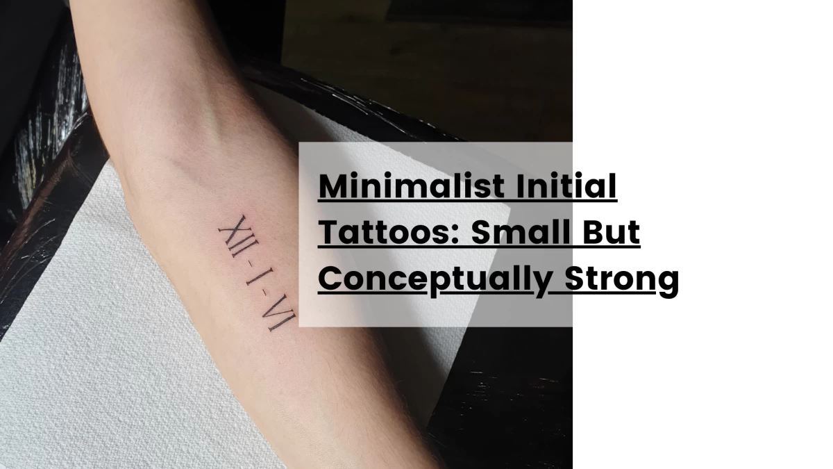
Minimalist Initial Tattoos: Small But Conceptually Strong
Initial tattoos have become particularly popular in Dublin — especially among clients looking for subtle, symbolic designs.
Why initials work so well:
-
Graphically minimal
-
Less literal
-
More abstract
-
Easier to integrate into larger compositions later
A single letter can function as:
-
A tribute
-
A memory marker
-
A symbolic identity element
-
A design motif
When treated thoughtfully, initials become visual symbols rather than text.
Placement: Where Meaning Meets Visual Logic
Placement is often underestimated.
But anatomy shapes perception.
A tiny name on the wrist feels different from the same name on the collarbone.
Wrist & Forearm: The Dublin Favourite
Clean. Visible. Balanced.
These placements work exceptionally well for:
-
Micro lettering
-
Initial tattoos
-
Dates
-
Minimalist scripts
They align naturally with body lines, making typography easier to integrate.
Ribcage & Side Body: The Intimate Zone
More private. More personal.
Often chosen for:
-
Memorial tattoos
-
Deeply personal names
-
Emotional tributes
Less about visibility, more about personal significance.
Collarbone & Shoulder: Soft Elegance
Perfect for flowing scripts and delicate lettering.
Typography follows bone structure → results feel organic, not imposed.
The Psychological Layer No One Talks About
Name tattoos are emotionally complex.
They’re not just aesthetic decisions — they’re identity statements.
They touch on:
-
Attachment
-
Memory
-
Permanence
-
Narrative
Interestingly, minimalist name tattoos often correlate with a more introspective motivation.
Less “look at this”. More “this matters to me”.
Which is a noticeable shift in tattoo culture overall.
“But What If I Regret It?”
The classic question.
Here’s the rational perspective.
Yes, regret is possible.
But regret is rarely caused by the concept itself.
It’s usually caused by:
-
Poor execution
-
Bad placement
-
Trend-driven fonts
-
Impulsive scale choices
In other words — design errors, not emotional ones.
A well-designed minimalist lettering tattoo tends to age both visually and psychologically far better than expected.
Why Lettering Tattoos Require a Skilled Studio
People call it “just words” like it’s the easy option. It isn’t.
Lettering is one of the most technically exposed tattoo styles you can choose, because there’s nowhere to hide. No shading, no texture, no heavy composition to distract the eye. If something is slightly off, your brain catches it immediately — even if you can’t explain why.
And the margin of error? Microscopic.
A few tenths of a millimetre too deep and a thin line becomes a blur over time. A slight wobble in the hand and your “clean minimal” tattoo suddenly reads as shaky. One spacing mistake and the whole piece feels unbalanced — not because the client is picky, but because typography is literally built on proportion and rhythm.
Unlike illustrative tattoos, text-based designs expose everything:
-
Line inconsistencies: when the stroke weight changes unintentionally, letters stop feeling elegant and start feeling “handwritten in a rush.”
-
Depth variations: too light = patchy healing; too deep = spreading/blur (especially on micro-lettering).
-
Shaky execution: script and fine serif styles punish hesitation. If the motion isn’t confident, it shows.
-
Spacing mistakes: bad kerning is the silent killer. Letters can be technically correct and still look wrong.
This is why at Black Hat Tattoo Studio Dublin, lettering isn’t treated like decorative filler. Not as the “quick little one” squeezed between appointments. Not as an afterthought, and definitely not as something you improvise on skin.
We treat it as precision work — closer to graphic design meets needle control.
That means we care about:
-
How it reads from a distance and up close
-
How it flows with anatomy (skin tension and body curves change typography)
-
How it will age (because clean now but blurry later is not a win)
-
How the spacing feels (balance is a design choice, not luck)
Because the truth is: minimalist lettering only looks effortless when it’s done with discipline.
And that’s the point.
A name or initial tattoo can be tiny, discreet, even almost invisible to everyone else — but if it’s done right, it carries a quiet kind of authority. The kind that doesn’t need to shout to be serious.
Subtle Tattoos, Strong Statements
Minimalist name and initial tattoos represent something interesting in modern tattoo culture.
They reject excess.
They favour clarity.
They prioritise meaning over spectacle.
And paradoxically — they often require more technical discipline than large, complex pieces.
Because simplicity is unforgiving.
The New Narrative Around Name Tattoos
The stigma is fading.
Slowly but visibly.
Today’s name tattoos are:
-
Understated
-
Typographically refined
-
Emotionally grounded
-
Design-led
They’re no longer dramatic gestures.
They’re curated personal markers.
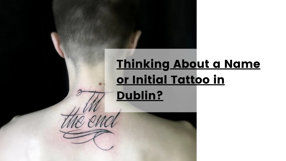
Thinking About a Name or Initial Tattoo in Dublin?
If you’re considering a lettering tattoo, the process matters as much as the design.
At Black Hat Tattoo Studio Dublin, consultations typically focus on:
-
Typography selection
-
Scale & longevity
-
Anatomical flow
-
Visual balance
-
Aging behaviour
Because the difference between “minimalist and elegant” vs “small but awkward” is rarely accidental.
It’s structural.
Final Thought: Meaning Doesn’t Need to Be Loud
Not every tattoo needs to dominate visual space.
Not every tribute needs symbolism layered on symbolism.
Sometimes, a name — executed with precision and restraint — says more than a full illustrative composition ever could.
Clean.
Quiet.
Intentional.

Hélène


This might interest you
Here’s a selection of related posts