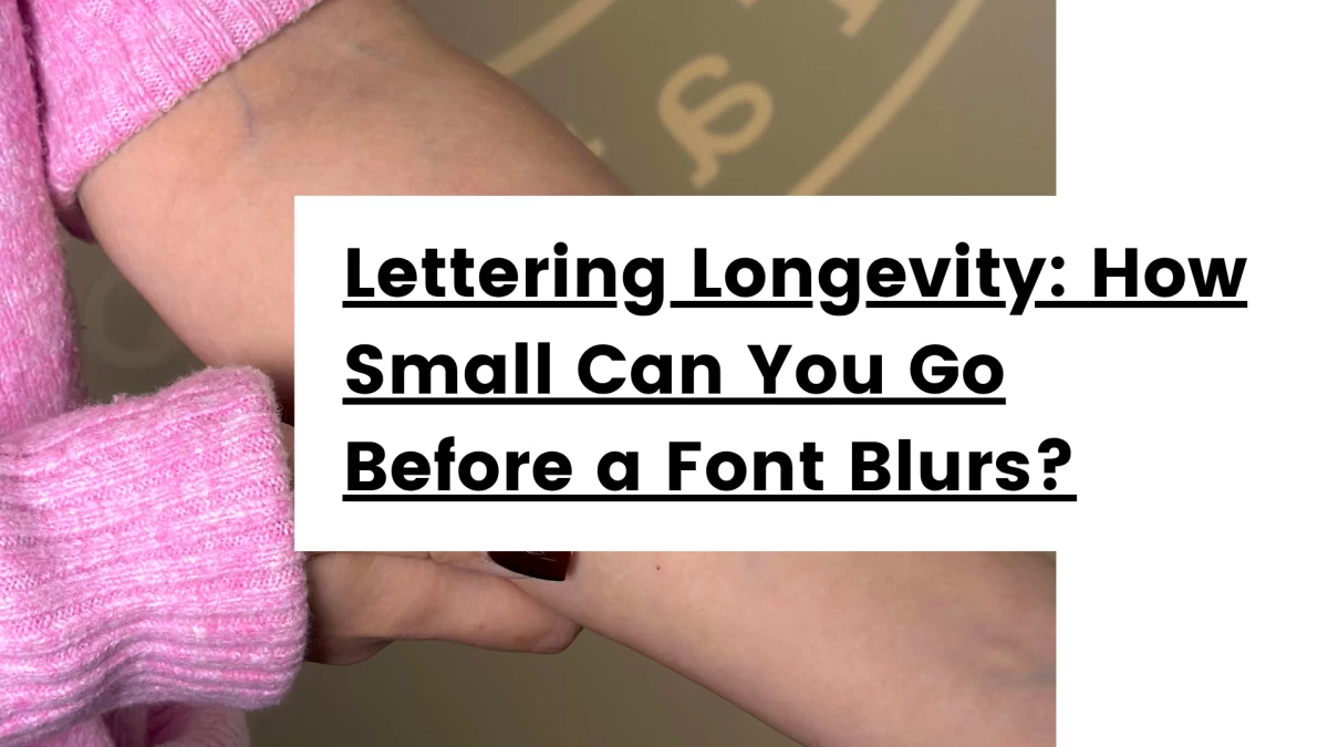
Lettering Longevity: How Small Can You Go Before a Font Blurs?
Fine line script looks beautiful on day one—but if your tattoo is too small, time will edit it for you. Here’s how to make sure your lettering tattoo lasts.`
Everyone wants the tiny tattoo.
The delicate wrist quote. The single word behind the ear. The micro-script on the ribs that looks subtle, elegant, and emotionally devastating in exactly the right way.
We get it.
Minimal tattoos are beautiful. Fine line lettering can look incredibly clean when it’s done well. The problem is that most people are designing tattoos for the first six weeks, not for the next fifteen years.
And skin, unfortunately, has opinions.
At Black Hat Tattoo in Dublin, one of the most common conversations we have is not “what should I get?” but “can I make it smaller?”
Usually, the honest answer is: probably not.
Or more accurately: yes, physically we can make it smaller. Emotionally, spiritually, and from the perspective of Future You trying to figure out whether your tattoo says “always” or “anxiety,” maybe we shouldn’t.
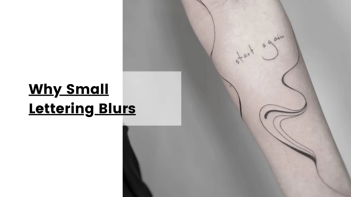
Why Small Lettering Blurs
Let’s start with the science, because tattoo regret is often just biology with bad timing.
When a tattoo heals, ink settles beneath the skin. It doesn’t stay as razor-sharp as it looked fresh. Over time, lines soften slightly and spread a little. This is normal. This is not your artist sabotaging your life.
It happens with all tattoos, but it matters most with lettering.
Why?
Because letters rely on spacing.
Tiny spaces between letters. Tiny counters inside letters like “a,” “e,” and “o.” Tiny distinctions between words.
When those spaces are too small, time closes them.
That elegant script becomes a legal dispute.
That delicate name becomes an ancient curse.
That inspirational quote becomes something your friends politely pretend they can read.
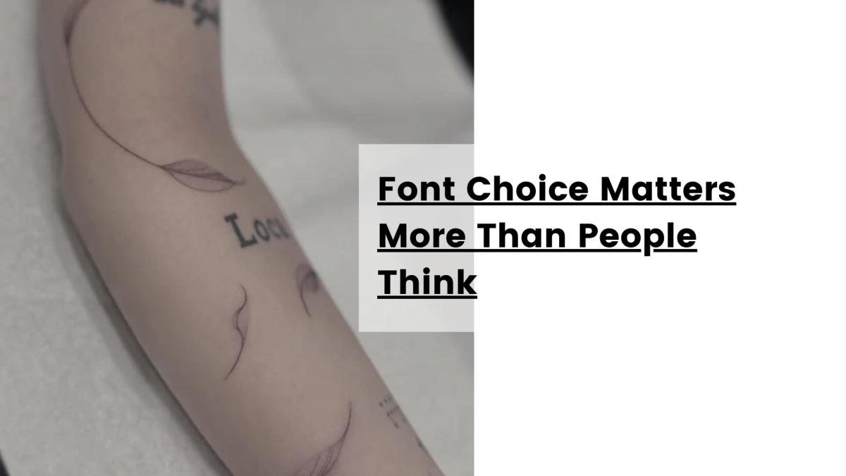
Font Choice Matters More Than People Think
Not all fonts age the same.
Some fonts are basically begging for a cover-up.
Ultra-thin cursive with excessive loops? Dangerous.
Overly decorative script where every letter touches like they’re in a toxic relationship? Also dangerous.
Tiny serif fonts with microscopic details? Brave, but risky.
Fonts that generally age better:
-
Clean script with breathing room
-
Simple cursive with clear separation
-
Fine line print fonts
-
Minimal serif with proper spacing
-
Slightly bolder script rather than ultra-thin microline work
The goal is not just elegance.
The goal is readability in ten years.
People often focus too much on how the tattoo looks on Pinterest and not enough on how it will look on actual human skin after life happens.
Skin is not a phone screen.
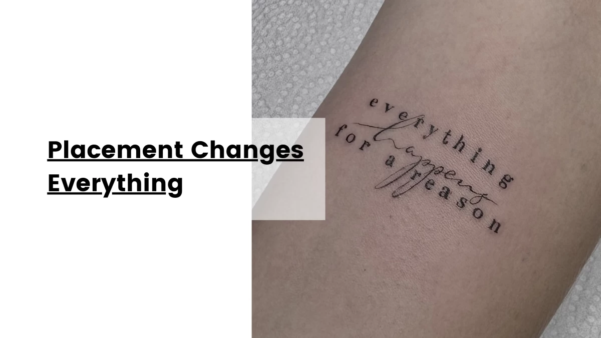
Placement Changes Everything
The same tattoo will age differently depending on where it lives.
Some areas of the body naturally hold fine detail better.
Generally better for lettering:
-
Inner forearm
-
Upper arm
-
Outer forearm
-
Upper thigh
-
Shoulder blade
-
Calf
Higher risk for tiny script:
-
Fingers
-
Side of hands
-
Feet
-
Ribs (depending on skin and movement)
-
Neck
-
Behind the ear
-
Wrists with extremely fine detail
Areas with constant friction, movement, sun exposure, or thinner skin tend to challenge fine line tattoos more.
That tiny quote on your finger might look incredible for three weeks and then start making questionable life choices.
Placement is not just aesthetic.
It is structural.
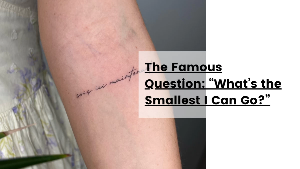
The Famous Question: “What’s the Smallest I Can Go?”
Here is the answer nobody likes:
Big enough to survive.
That’s it.
There is no universal millimetre rule because it depends on:
-
Font style
-
Number of letters
-
Placement
-
Skin texture
-
Line weight
-
Your artist’s technique
-
How your skin heals
But as a general principle:
Single words can go smaller safely.
Full sentences need more room.
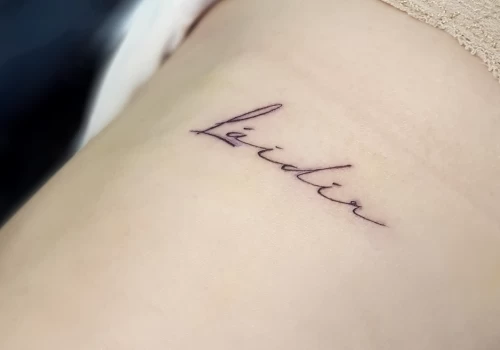
Names in fine cursive need more space than people think.
Micro tattoos copied from celebrity Pinterest boards are often designed for photographs, not longevity.
If your artist says it needs to be larger, they are usually protecting your future, not ruining your aesthetic.
Try trusting them.
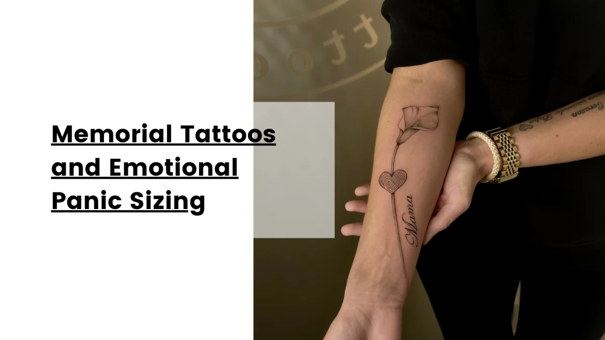
Memorial Tattoos and Emotional Panic Sizing
This happens constantly.
Someone wants a loved one’s handwriting tattoo and insists it has to be tiny because they want it “discreet.”
Completely understandable.
Also often a mistake.
Handwriting especially needs space because it is irregular by nature. It is not a clean digital font. It has personality, pressure, uneven lines.
That is exactly why it matters.
Making it too small removes the very thing that makes it meaningful.
A signature should still feel like their signature.
Not like a suspicious scratch discovered on old furniture.
Sometimes slightly bigger is actually more subtle emotionally, because it preserves the integrity of the piece.
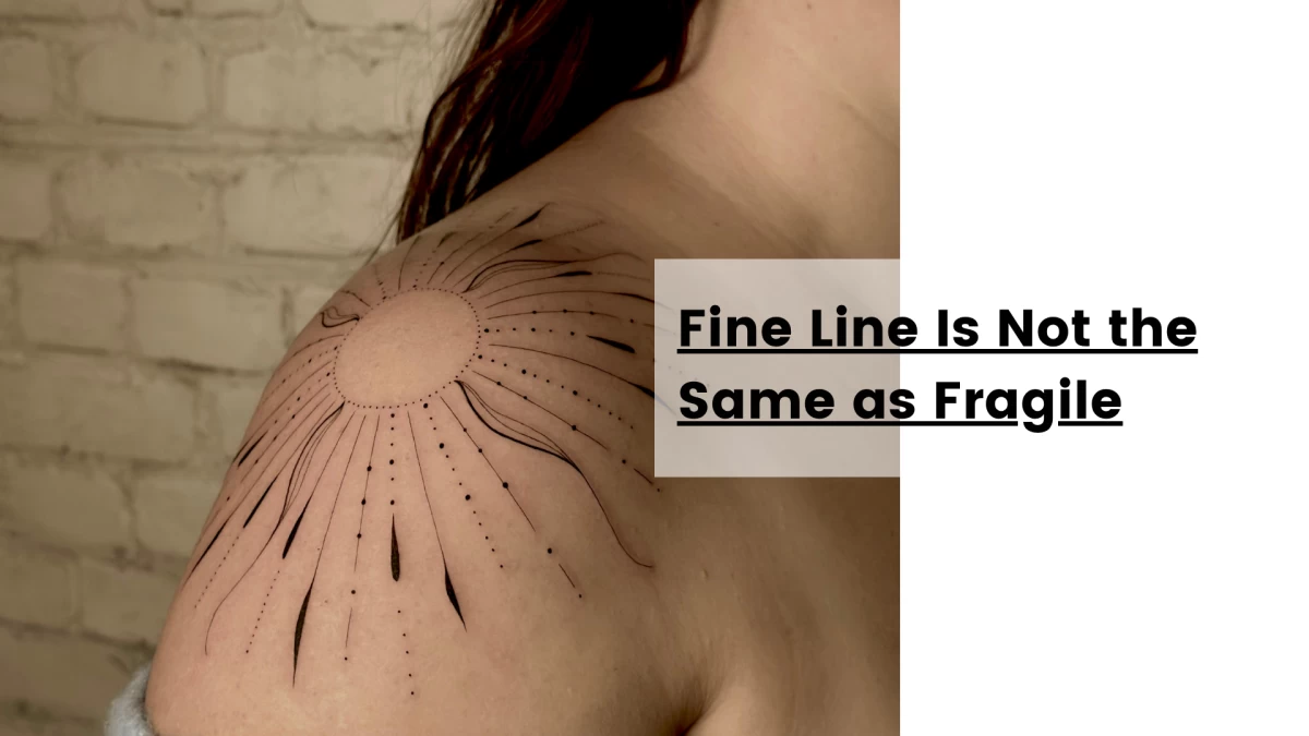
Fine Line Is Not the Same as Fragile
People confuse these constantly.
Fine line does not mean weak.
Good fine line work is precise, intentional, and built for longevity.
Bad fine line work is just timid.
An experienced artist knows how to balance delicacy with enough structure for the tattoo to age properly.
Sometimes that means making the lines slightly stronger than what you imagined.
That is not ruining the tattoo.
That is making sure it still exists in eight years.
Your tattoo should survive both healing and bad life decisions.
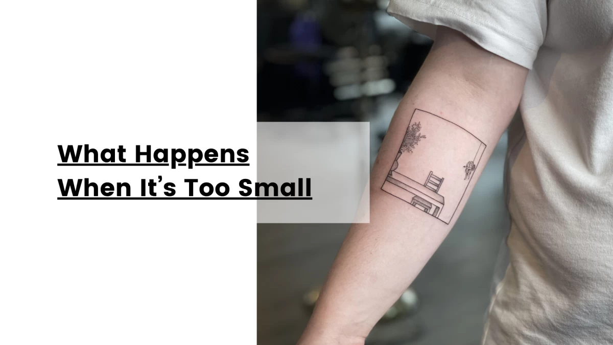
What Happens When It’s Too Small
Usually one of three things:
The letters blur together.
The counters close up.
The words become unreadable.
Sometimes all three, like a little cursed trilogy.
This is especially common with:
-
Quotes longer than necessary
-
Ultra-thin cursive
-
Finger script
-
Cheap fine line work
-
Poor aftercare combined with sun abuse and optimism
Laser removal clinics are full of people who once said, “No no, smaller is better.”
History is trying to teach us things.
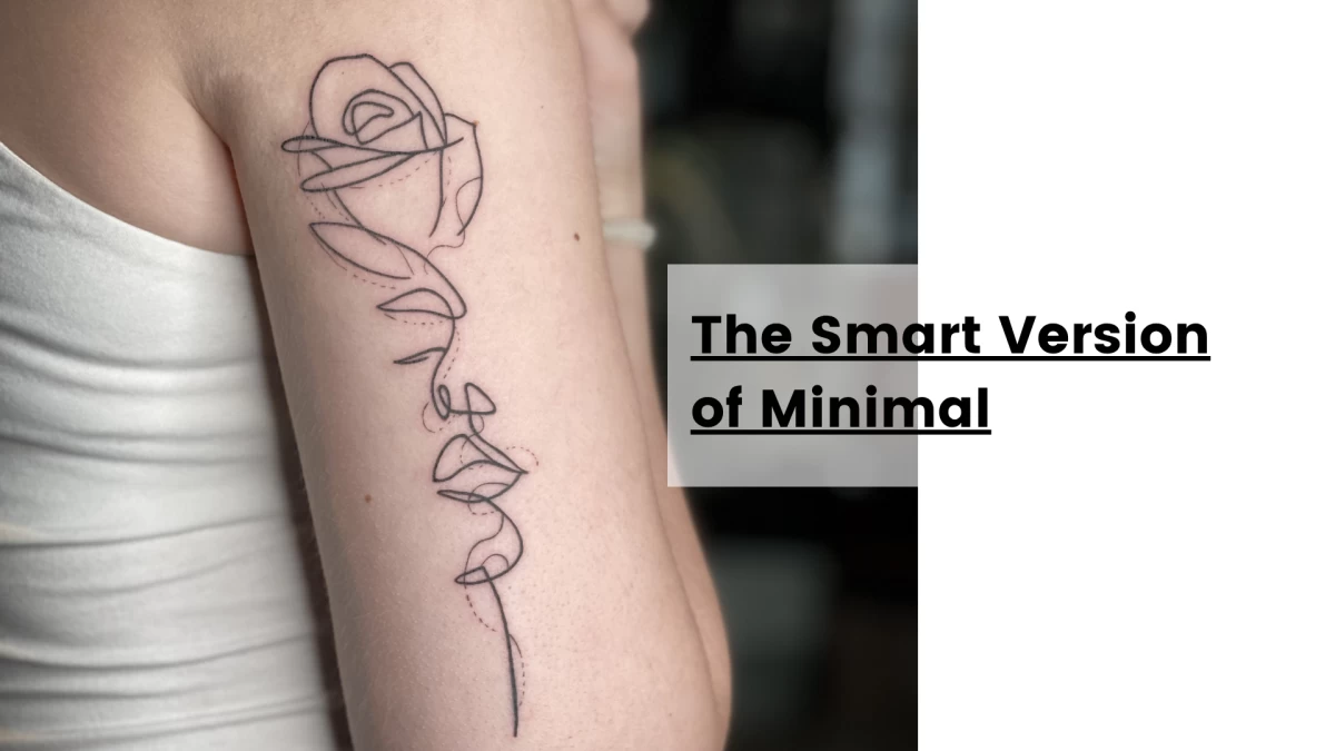
The Smart Version of Minimal
Minimal does not mean microscopic.
Minimal means intentional.
Sometimes shortening the phrase is better than shrinking the font.
Instead of tattooing:
“She believed she could so she did”
maybe just tattoo:
“she did”
Same emotional impact. Less visual chaos. Significantly less chance of future archaeological confusion.
The strongest lettering tattoos are usually the simplest.
Not because simple is trendy.
Because simple survives.
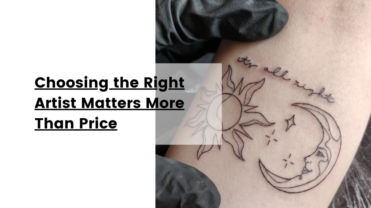
Choosing the Right Artist Matters More Than Price
This is not where you bargain hunt.
Lettering tattoos look simple. They are not.
Spacing, line consistency, pressure control, placement strategy, healing knowledge—this is technical work.
A badly done lettering tattoo ages fast and regrets loudly.
A good one looks effortless.
That difference is skill.
Not luck.
Not “my friend knows a guy.”
Skill.
Especially for script, memorial tattoos, signatures, and anything emotionally important, choose the artist first and the price conversation second.
Cheap tattoos are often very expensive later.
Final Thought
The best lettering tattoos are designed for the person you will be later, not just the person booking the appointment now.
Fresh tattoos are temporary.
Healed tattoos are the real tattoo.
At Black Hat Tattoo in Dublin, we would rather tell you the honest truth—that your font needs more space, your script needs adjusting, or your quote needs editing—than give you exactly what you asked for and let time destroy it politely.
Because tiny tattoos are cute.
Readable tattoos are better.
And “trust me, it says something beautiful” is not the legacy most people are aiming for.
Hélène
This might interest you
Here’s a selection of related posts